Zingchart is a popular javascript charting library.It has support for all kind of charts like pie chart, bar charts, area charts and many more. For more information you can visit the below given link:
In this blog we will see how we can render a pie chart using zinchart library? And what to do when we need to draw multiple pie charts simultaniously?
So first we will look for how we can draw a single pie chart using Zingchart library ?
Steps for drawing pie chart!
Before starting , we have to include zingchart-html5-min.js file in our html file.
Now we can check what all we need to draw the chart?
- A container <div></div> tag to draw the chart.
- Data for the pie chart
- A method to render the chart
Container for the Pie Chart
We need a <div></div> container with an id to draw the chart. So first we need to create a HTML file which has the div container tag.
<html>
<head>
<script type="text/javascript" src="zingchart-html5-min.js"> //Zingchart library
</head>
><body>
<div id="myChartDiv"></div> // chart container
</body>
</html>
Now we have the container <div></div> tag.Next we have to create the data for the pie charts.
Creating data for Pie Chart
Data for drawing the chart is in the form of JSON object .
<script>

var myChartData={
 "graphset":[
 {
 "plot":{
   "value-box":{
   "text":"%v",
   "placement":"in"
 }
 },
 "type":"pie",
 "series":[
 {
 "values":[20]
 },
 {
 "values":[36]
 },
 {
 "values":[42]
 },
 {
 "values":[2]
 }
 ]
 }
 ]
};
<script>
Now we have the data to draw a single Pie Chart. So next we have to render the data inorder to get the chart. For that we will write a render function.
Rendering-Pie chart
The render function will look like as follows.
window.onload=function(){
zingchart.render({
id : "myChartDiv",
height : 450,
width : 600,
data : myChartData
});
};
In the render method we have four mandatory fields.
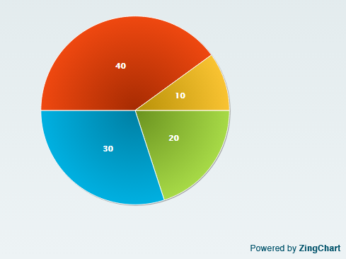
The “id” field will have the id of our container div tag. height and width will specify the height and width of the chart.Data is our json object. After rendering the pie chart will look like this.
So this will draw a single pie chart in the given “id”. So what should we do to render multiple charts in a single div?The answer is too simple, We need to pass an arrays to the “value” key in the “series”.
Rendering multiple Pie Charts in a Div
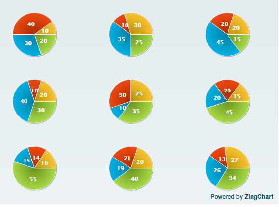
For that, we need to pass an array of data to the series as values. Either we can use an array itself or we can put all arrays in a single object and we can pass that too.So after modification the “series” item will look like this,
 "series":[
 {
 "values":[20,25,15,30,35,45,55,40,34]
 },
 {
 "values":[30,35,45,40,10,20,15,19,26]

 },
 {
 "values":[40,10,20,10,30,20,14,21,13]
 },
 {
 "values":[10,30,20,20,25,15,16,20,27]
 }
 ]
And the myChartDiv will change like this,
Setting the size of Pie Chart
For setting the size of each pie that we are drawing we can use “size”key.
"type":"pie",
"size":100,
"series":[
{
"values":[20,25,15,30,35,45,55,40,34]
},
{
"values":[30,35,45,40,10,20,15,19,26]

},
{
"values":[40,10,20,10,30,20,14,21,13]
},
{
"values":[10,30,20,20,25,15,16,20,27]
}
]
Setting rules for checking conditions
What do we do if we need to change the colour of the chart portion according to the value? or we need to hide the charts which is having a value “0” or any other condition.We need to check for the condition. For that we will set rules in zingchart.
So we will change our “series” like this,
 "series":[
 {
 "values":[20,25,15,30,35,45,55,40,60],
 "background-color":"#99CC00",
"rules":[
{
"rule":"%v > 50",
"background-color":"orange"
},
{
"rule":"%v <20",
"background-color":"#CC0066"
}
]
 },
 {
 "values":[30,35,45,40,10,20,15,19,10],
"background-color":"#FF0000",
"rules":[
"rule":"%v > 50",
"background-color":"orange"
},
{
"rule":"%v <20",
"background-color":"#CC0066"
}
]
 },
 {
 "values":[40,10,20,10,30,20,14,21,20],
"background-color":"#CFA600",
"rules":[
{
"rule":"%v > 50",
"background-color":"orange"
},
{
"rule":"%v <20",
"background-color":"#CC0066"
}
]
},
 {
 "values":[10,30,20,20,25,15,16,20,10],
"background-color":"#0066FF",
"rules":[
{
"rule":"%v > 50",
"background-color":"orange"
},
{
"rule":"%v <20",
"background-color":"#CC0066"
}
]
}
]
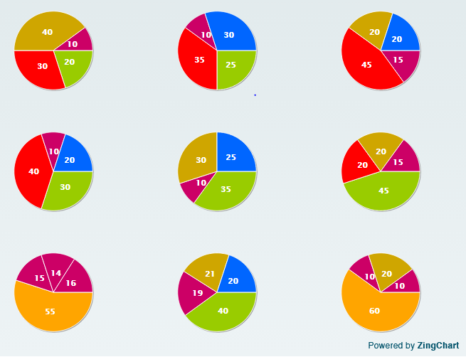
And the output window will look like this,
There are lot of other things that we can do in pie charts using Zingchart library. For that you can visit the Zingchart official website.


7 comments
[…] the previous blog we have seen how we can render multiple pie charts in a single div, now we can check how we can […]
Thank for you covering this topic! You actually chose an interesting way to include multiple charts. Another way is to place them individually within a graphset. This is especially helpful when you want to use more than one type of chart.
Here is the code:
{

"graphset":[

    {

        "type":"line",

        "series":[

            {

                "values":[69,68,54,48,70]

            },

            {

                "values":[51,53,47,60,48]

            }

        ]

    },

    {

        "type":"area",

        "series":[

            {

                "values":[69,68,54,48,70]

            },

            {

                "values":[51,53,47,60,48]

            }

        ]

    },

    {

        "type":"bar",

        "series":[

            {

                "values":[69,68,54,48,70]

            },

            {

                "values":[51,53,47,60,48]

            }

        ]

    },

    {

        "type":"hbar",

        "series":[

            {

                "values":[69,68,54,48,70]

            },

            {

                "values":[51,53,47,60,48]

            }

        ]

    }

]

}
Also you can view the resulting charts at: http://www.zingchart.com/playground/run/543c40e97ce0e
Thanks again, and please let us know if we can provide any additional info 🙂
Hello,
Is it possible to render multiple charts in different divs in the same page?
Yes, it is possible by passing multiple div id’s. The charts are getting displayed in the id’s that we are giving in the id field of zingchart render method.
Somehow the same method is not working for Gauge chart.
I am trying to create the JSON on the fly from a datatable.
Lets say there is a column called Variation by Region [1.2,0.9,1.1]
0.1 on both sides of 1 is OK, beyond that is ‘Red’
Any easy way to build multiple charts without repeating the whole Json?
This is what I am trying at the moment. As you notice, two needles appear on the same Gauge instead of two gauges
{“graphset”:[{“type”:”gauge”,”background-color”:”#A20467″,”scale-r”:{“values”:”0:100:20″,”line-color”:”none”,”guide”:{“background-color”:”black”,”alpha”:1},”tick”:{“line-width”:3,”line-color”:”white”,”size”:14},”minor-ticks”:4,”minor-tick”:{“line-color”:”white”,”visible”:true,”size”:7,”placement”:”inner”},”item”:{“color”:”white”,”placement”:”inner”,”offset-r”:-5},”aperture”:270,”center”:{“background-color”:”#CC0000″,”size”:11},”background-color”:”black”,”ring”:{“type”:”circle”,”size”:8,”rules”:[{“rule”:”%v=40″,”background-color”:”limeGreen”,”border-width”:0},{“rule”:”%v>=60″,”background-color”:”red”,”border-width”:0}]}},
“labels”:[{“text”:’Oct-15′,”color”:”white”,”width”:”6%”,”x”:”47%”,”y”:”76%”},{“text”:’Oct-16′,”color”:”white”,”width”:”6%”,”x”:”47%”,”y”:”76%”}]
,
“series”:[{“values”:[64.5],”background-color”:”white”,”shadow”:false,”size”:50,”csize”:8},{“values”:[44.5],”background-color”:”white”,”shadow”:false,”size”:50,”csize”:8}]
}]}
Whether you have seen the previous comment by Merrily.? Try by including an array of graphset velues, then you don’t have to repeat the whole json again, simply you can add one more type in the graphset.
I suppose you haven’t encountered the requirement in real life.
The problem is that the syntax for parsing values is different for the Pie/Guage vs Bar/Line etc.
Try to load data from SQL and create JSON dynamically. The number of datapoints is not known beforehand, that is, I do not know if there are 12 Y axis values or 20
The ‘Y’ values repeat quite nicely in Bar charts (12,34,66..) which is somewhat easy to custom script. On the other hand, the Guage chart has syntax like Series…Value(12)…
Series… Value(34)..
Merrily is from ZingChart team. Ideally they should have had an inbuilt function which accepts values in the same format/syntax for all chart types as an array.
This was the problem with Amcharts as well, which is one of the reasons we stopped using that.
Anyhow, I have ended up writing a function which takes the dataset and ‘charttype’ as variables and outputs the required JSON.
2D table from standard sql is the most common database output. Native support to parse tabular data would have been nice. Perhaps they can include in the next version of zing js