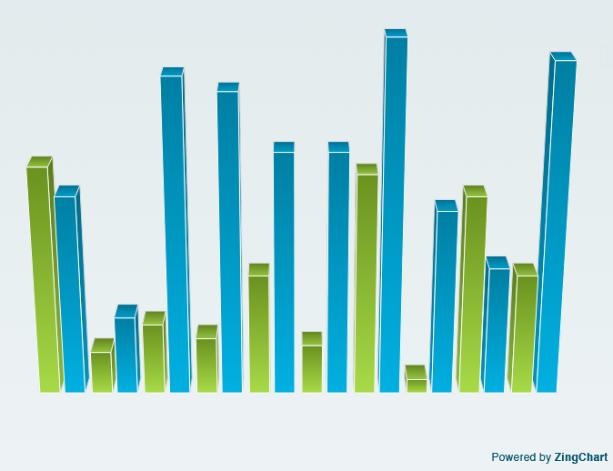
In the previous blog we have seen how we can render multiple pie charts in a single div, now we can check how we can create mirrored bar charts using zingchart.
First we can check how we can render a bar chart using Zingchart.Steps for creating the bar chart is exactly the same as drawing pie chart. Only the data used for rendering the chart will change.
Any way will look once again the steps.
- A container div tag with a unique id
- Data for rendering the chart
- A render method to draw the chart
Setting the data for bar chart
As we seen already the data is in the form of a JSON object there are many other ways to pass the data.we can check that,
- include data via a CSV file
- load data from a URL
- pass data as a JSON object
- pass data as a javascript object
- connect with your data via zingchart API and AJAX
- create a websocket connection to pull and push data
We will pass the data as a json object.
Creating data for bar chart
<script>
var myChartData={
"graphset":[
{
"plot":{

},
"scale-x":{
},
"scale-y":{
},
"type":"bar",
"series":[
{
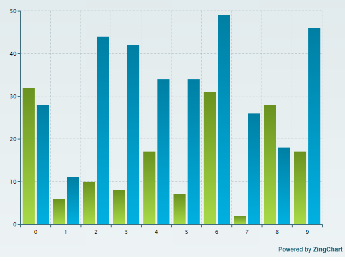
"values":[32,6,10,8,17,7,31,2,28,17]
},
{
"values":[28,11,44,42,34,34,49,26,18,46]
}
]
}
]
};

</script>
This will act as the data for the bar chart. We have changed the value of “type” key to “bar” to notify the Zingchart render that the data is for bar chart.And we need x-axis and y-axis for the bar chart. The render method is same as the pie chart.
window.onload=function(){
zingchart.render({
id : "myChartDiv",
height : 550,
width : 700,
data : myChartData
});
};
The output will look like this,
Hiding the ticks and guides -Bar Chart
For that we just need to include the below attached code snippet in the “scale-x” and “scale-y” key.
"scale-x":{
"guide":
{
"visible":0
},
"tick":{
"visible":0
}
},
"scale-y":{

"guide":
{
"visible":0
},
"tick":{
"visible":0
}

}
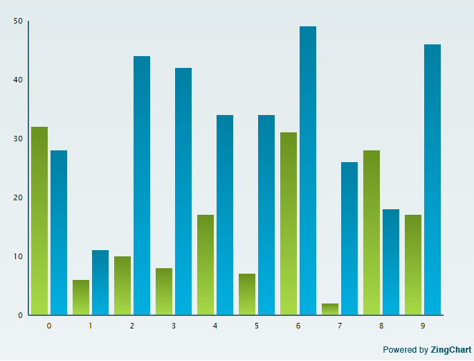
The bar chart will look like this then,
“visible ” key can have either 0,1,true or false as values.
Hiding the axis – Bar chart
What to do if we don’t want the x and y-axis to be displayed on the chart?
"scale-x":{
"visible":0
},
"scale-y":{

"visible":0

},
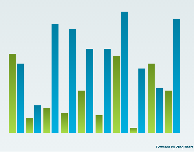
The Bar chart will look like this then,
Want to add some 3D effect?
If you feel like want to add some 3D effect.It is too simple in Zingchart. we just need to change the value of “type” key to “bar3d”
"type":"bar3d", // adding 3D bars
Creating mirrored bar chart
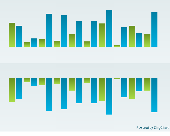
There may situations that we need to display positive values in the – y axis or display some mirrored charts.It is too simple to implement with zingchart,
We just need to put the key “mirrored” and value either “1” or “true” inside the “scale-y” key.
var myChartData={
"graphset":[
{
"plot":{

},
"scale-x":{
"visible":0
},
"scale-y":{

"visible":0

},
"type":"bar",
"series":[

{
"values":[32,6,10,8,17,7,31,2,28,17],
"text":"Item 0"
},
{
"values":[28,11,44,42,34,34,49,26,18,46],
"text":"Item 1"
}
]
},
{
"plot":{

},
"scale-x":{
"visible":0
},
"scale-y":{

"visible":0,

"mirrored":1   // getting mirrored bar chart

},
"type":"bar",
"series":[

{
"values":[32,6,10,8,17,7,31,2,28,17],
"text":"Item 0"
},
{
"values":[28,11,44,42,34,34,49,26,18,46],
"text":"Item 1"
}
]

}

]
};
The output will look like this,
In Bar chart also we can add “rules” for checking conditions and there are many other properties we can use. For further details visit Zingchart official website.
